Updates:
(5 Sep 2015): US Presidential candidate Rick Santorum used an erroneous interpretation of our survey results on the Bill Maher show. My detailed response to Santorum’s claim is in a newer blogpost. Politifact and Factcheck also chimed in and found Santorum’s claims to be false. The blogpost below goes into detail about how different interpretations could lead to different conclusions and how some interpretations are better supported than others.
As Michael Tobis rightly points out, the level of scientific consensus that you find “depends crucially on who you include as a scientist, what question you are asking, and how you go about asking it”. And on how you interpret the data. We argued that our survey results show a strong scientific consensus that global warming is predominantly caused by anthropogenic greenhouse gases. Others beg to differ. Recent differences of opinion are rooted in different interpretations of the data. Our interpretation is based on how we went about asking certain questions and what the responses indicate.
To quantify the level of agreement with a certain position, it makes most sense to look at the number of people as a fraction of those who answered the question. We asked respondents two questions about attribution of global warming (Q1 asking for a quantitative estimate and Q3 asking for a qualitative estimate; the complete set of survey questions is available here). However, as we wrote in the ES&T paper:
Undetermined responses (unknown, I do not know, other) were much more prevalent for Q1 (22%) than for Q3 (4%); presumably because the quantitative question (Q1) was considered more difficult to answer. This explanation was confirmed by the open comments under Q1 given by those with an undetermined answer: 100 out of 129 comments (78%) mentioned that this was a difficult question.
There are two ways of expressing the level of consensus, based on these data: as a fraction of the total number of respondents (including undetermined responses), or as a fraction of the number of respondents who gave a quantitative or qualitative judgment (excluding undetermined answers). The former estimate cannot exceed 78% based on Q1, since 22% of respondents gave an undetermined answer. A ratio expressed this way gives the appearance of a lower level of agreement. However, this is a consequence of the question being difficult to answer, due to the level of precision in the answer options, rather than it being a sign of less agreement.
Moreover, the results in terms of level of agreement based on Q1 and Q3 are mutually consistent with each other if the undetermined responses are omitted in calculating the ratio; they differ markedly when undetermined responses are included. In the supporting information we provided a table (reproduced below) with results for the level of agreement calculated either as a fraction of the total (i.e., including the undetermined answers) or as a fraction of those who expressed an opinion (i.e., excluding the undetermined answers), specified for different subgroups.

For the reasons outlined above we consider the results excluding the undetermined responses the most meaningful estimate of the actual level of agreement among our respondents. Indeed, in our abstract we wrote:
90% of respondents with more than 10 climate-related peer-reviewed publications (about half of all respondents), explicitly agreed with anthropogenic greenhouse gases (GHGs) being the dominant driver of recent global warming.
This is the average of the two subgroups with the highest number of self-reported publications for both Q1 and Q3. In our paper we discussed both ways of quantifying the level of consensus, including the 66% number as advocated by Tom Fuller (despite his claims that we didn’t).
Fabius Maximus goes further down still, claiming that the level of agreement with IPCC AR5 based on our survey results is only 43-47%. This result is based on the number of respondents who answered Q1b, asking for the confidence level associated with warming being predominantly greenhouse gas-driven, as a fraction of the total number of respondents who filled out Q1a (whether with a quantitative or an undetermined answer). As Tom Curtis notes, Fab Max erroneously compared our statement to the “extremely likely” statement in AR5, whereas in terms of greenhouse gases AR5 in Chapter 10 considered it “very likely” that they are responsible for more than half the warming. Moreover, our survey was undertaken in 2012, long before AR5 was available, so if respondents had IPCC in mind as a reference, it would have been AR4. If anything, the survey respondents were by and large more confident than IPCC that warming had been predominantly greenhouse gas driven, with over half assigning a higher likelihood than IPCC did in both AR4 and AR5.

Let me expand on the point of including or excluding the undetermined answers with a thought experiment. Imagine that we had asked whether respondents agreed with the AR4 statement on attribution, yes or no. I am confident that the resulting fraction of yes-responses would (far) exceed 66%. We chose instead to ask a more detailed question, and add other answer options for those who felt unwilling or unable to provide a quantitative answer. On the other hand, imagine if we had respondents choose whether the greenhouse gas contribution was -200, -199, …-2, -1, 0, 1, 2, … 99, 100, 101, …200% of the observed warming. The question would have been very difficult to answer to that level of precision. Perhaps only a handful would have ventured a guess and the vast majority would have picked one of the undetermined answer options (“I don’t know”, “unknown”, “other”). Should we in that case have concluded that the level of consensus is only a meagre few percentage points? I think not, since the result would be a direct consequence of the answer options being perceived as too difficult to meaningfully choose from.
Calculating the level of agreement in the way we suggest, i.e. excluding undetermined responses, provides a more robust measure as it’s relatively independent of the perceived difficulty of having to choose between specific answer options. And, as is omitted by the various critics, it is consistent with the responses to the qualitative attribution question, which also provides a clear indication of a strong consensus. If you were to insist on including undetermined responses in calculating the level of agreement, then it’s best to only use results from Q3. Tom Fuller’s 66% becomes 83% in that case (the level of consensus for all respondents), showing the lack of robustness in this approach when applied to Q1.
Some other issues that came up in recent discussions:
- We cast a very wide net of respondents, including scientists who study various parts of climate change including impacts and mitigation.
- We made special efforts to include people with skeptical points of view, not all of whom are publishing climate scientists. As such, we probably slightly underestimated the strength of the scientific consensus.
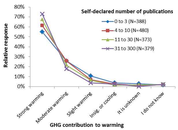
- Our results are in good agreement with other opinion surveys, including e.g. Doran and Kendall-Zimmermann. Literature surveys such as by Cook et al generally find higher levels of consensus, since -as we also found, see figure just above- more published scientists are generally more convinced of human causation of global warming.
- See my comment at CCNF for a short discussion on the relevance of scientific consensus and pros/cons of evaluating it be means of literature survey or opinion survey.
- The background report with all survey questions and aggregated responses is basically an accompaniment to the article in ES&T and is based on the same data.
See also the basic summary of our survey findings and the accompanying FAQ.


